Cartonama, Open Mapping in Bangalore
Posted: March 29th, 2012 | Author: mikel | Filed under: events, India, talks, tech | Leave a comment »The keystone to GroundTruth’s trip to India was the Cartonama workshop in Bangalore.

My comrade in maps was the amazing Schuyler Erle, in a reprise of our epic 2008 Free Map India tour. India, Banalore, and its OpenStreetMap have transformed (as you can see in this heart-filled animation of OSM Bangalore). This time, rather than visit 7 cities in 4 weeks, we crammed even more information into two days. As ever, I learned a ton from Schuyler. Perhaps the choicest bit being, “Canada is often projected as if the Earth was wearing a dunce cap”.
This was an intense two day workshop, covering everything needed to make an open web mapping application: from data collection in OpenStreetMap, to data juggling with OGR/PostGIS etc, making tiles with TileMill, and finally building an Ajax Web app with Leaflet and the OSM API. Oh, and also a survey of basic geographic concepts (geodesy, projections, etc), and the intricacies of the operation of GPS satellites. Really it was four workshops in one. Or maybe 10. Possibly a semesters worth. I think it’s a format worth replicating.
The end result was a modification to the amazing POSM POSM by Yuvi Panda. He built this HTML5 web app for first collecting bus stops in Mumbai. There were wonderful audible gasps when we integrated our home baked MapBox tiles into the locally running POSM app (even if we discovered lingering problems with handling of Indic fonts in Mapnik).
You can see all the presentation materials on GitHub. We collaborated on the slides in Markdown with Landslide, best way to make a presentation.

Cartonama was an Editor’s Pick in TimeOut!
Another great moment, during the ice breaker we stole from Gunner: “What’s your first memory of a computer?” “We had to take our shoes off before going in the lab because computers are holy, right?”
It seemed to go well. Was great to enthusiastic, creative participants from Servelots, TacticalTech, IT For Change, Transparent Chennai, and many others.
HasGeek did a wonderful job bringing bringing the workshop together, and are lighting up the geek event space in India. They’re really fostering community in the best way, and I’m excited to see what happens with all the mappers from our workshop, and the upcoming full Cartonama conference. So big thanks to HasGeek, and the Centre for Internet and Society for hosting and sponsoring the workshop.
The Amazing OSM Community, and the Tasking Server, Maps Swaziland
Posted: November 10th, 2011 | Author: mikel | Filed under: mics, openstreetmap, swaziland, tech | Leave a comment »One month ago, I asked what to do with 10 million GPS points, and it turns out one awesome answer is map an entire country.
I wanted to experiment with the new HOT Tasking Server, so I set up a task using the Swaziland GPS tiles, but I didn’t bother to promote the effort at all. One month later, and the task is 100% complete, and about 25% verified. Amazing work by the community, and a quickly proven, easy to use, compelling tool.
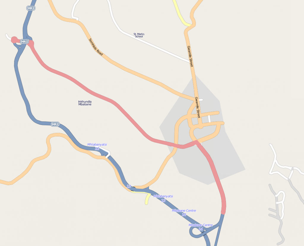
Here’s Mbabane, the capital of Swaziland, before the editing.
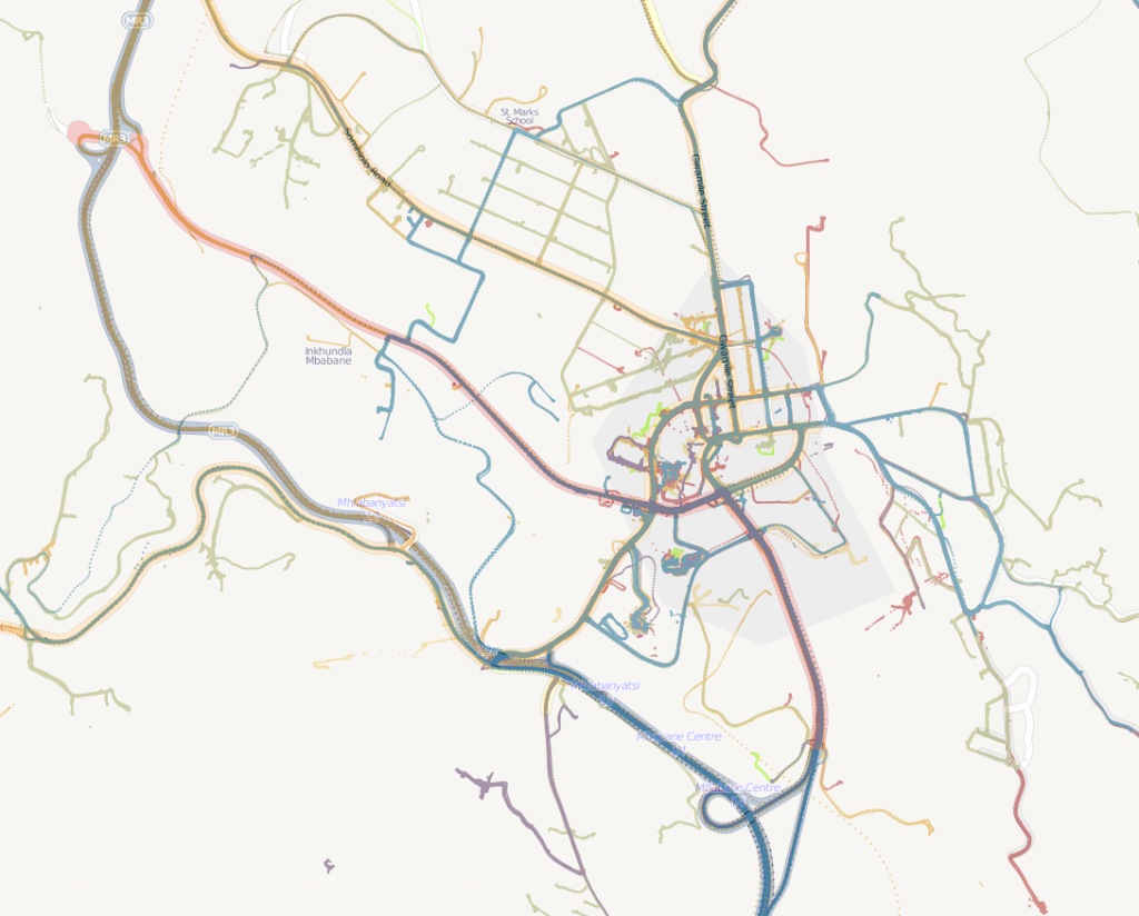
And here are the GPS traces of Mbabane, today.
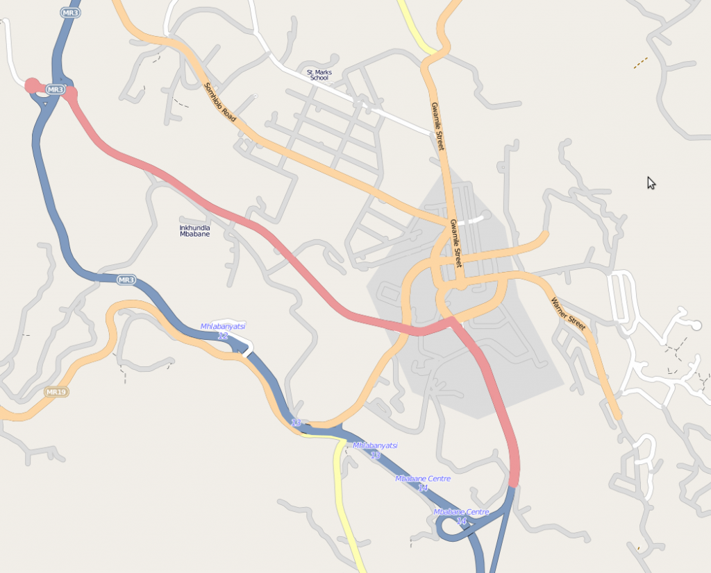
And finally, the map today.
New roads have been filled in throughout the country. It would be interesting to calculate the growth in road features over this month.
There are still lots to do. There are gaps in the GPS coverage, and Bing might help. This was only roads, and unnamed, unclassified roads at that. It’s really now up to the small and growing community of mappers in Swaziland to bring the map alive.
I asked some of the incredible top contributors about why they took part in the mapping, and how the tasking server helped out.
The tasking tool is really nice to keep the motivation up and to keep track of what’s already done. You see the progress and the small chunks are mostly manageable.
It is good for my inner self. It is rewarding on both a greater scale (creating a needed map) as well as a smaller scale. Also, I find tracing a very relaxing activity that leaves my analytical programmer’s mind open for podcasting, talking or just recuperating from the day.
It was a chance to contribute to a very underdeveloped part of the map and make a real difference to what was available in that country. This is also a country that would take a long time to reach a critical mass of roads without outside work. Hopefully this will give a base for people when they look at a rendered map, which in turn might encourage other people in/near Swaziland to fill in the gaps.
I like mapping because you get to look at somewhere in more detail than you normally would. I now have a real feeling for the geography of Swaziland.
I’ve been interested in HOT for a while and participate when I can, but it’s not always clear how to contribute. The task manager made that easy. To the larger question of why do this at all: it’s like knitting a sweater for millions of people at once.
I think it’s important to get the tile size right. For the Swaziland tracing, it was perfect. I peeked at another task (tracing buildings in Indonesia) and a single tile was too overwhelming.
stethoscope’s insight on the right tile size was among many great points of feedback. We’re learning lots about how to improve the experience of the tasking server even more, that’s getting captured in issue requests, and Pierre continues to push development.
It was after Haiti that this idea began brewing, with identified need for “Mechanical turk style process for working through and importing individual features from large imports” and “Tools for ongoing coordination and identifying needs, addressing the problem of what to map now?”. And really, it goes back to the search for Jim Gray. At my talk at Microsoft last weekend, I was fortunate enough to meet some of the team who worked on the first mechanical turk process for collaborative imagery interpretation … the inspiration has results!
What to do with 10 million GPS points?
Posted: October 3rd, 2011 | Author: mikel | Filed under: mics, openstreetmap, swaziland, tech | Leave a comment »10876681 to be exact. Recording once per second over 4+ months, eight GPS units were taken over every road in Swaziland (background on this survey). If not for some mishaps with batteries and missing SD cards, etc, the count would likely be double that.
Under the project description, the guidance had a lot of freedom for working with the GPS data: “Develop simple software demo interface, incl. analytical tools and manual for monitoring fuel consumption in household surveys.”. (In other words, do cool stuff). After some experimentation, we decided to go with three demonstrations: animation of the traces, tiles for use in OpenStreetMap data collection, and fuel consumption estimate plugin in JOSM. All the code is up on GitHub.
Visualization has always been an inspirational tool for data collection and holistic comprehension, especially in OpenStreetMap. Tom’s animation of London GPS tracks in 2005 is still inspirational, and more recently, ITO’s visualization of edits following the Haiti quake. I’ve used party render many times to animate traces during a mapping party, like this one in Mumbai, and experimented with different styles, like at Yuri’s Night.
The challenge here was to make a visualization on such a large number of points. Split up the task into processing and loading the GPX files into a PostGIS database, and then producing frames of an animation from the db. Having the database would also allow production of other products, like tiles. This set of scripts processes directories full of GPX; change the paths depending on your layout.
Thought about experimenting with SpatiaLite or ElasticSearch too, but that will wait for another time. libcinder would be an amazing platform to try, once geo support is in place.
The animation scripts generate a series of images using Mapnik, time slices from the db, and then the frames are assembled using a series of ImageMagick compositions and effects, and then the frames are combined into a movie using ffmpeg.
The result pretty clearly show the progress of each survey team over the months, with Swaziland as a whole emerging by the end. If there had been more time, would have experimented with more dramatic effects, movement of the camera view, music.
Tiles allow for careful exploration of this large data set. This map has shows all 10 million points rendered together. You can notice that a large number of the GPS traces cover new ground for OSM, so can be used as a tracing source for OSM. Typically in OSM, GPS traces are uploaded/downloaded for tracing, but with the high volume of points, it’s just not practical. The number of points over a particular segment of road gives some sense of its “importance” and “classification” (more used, more likely a major road).The tiles can be configured for use in tracing in Potlatch (http://rockburger.com/mics/tiles/!/!/!.png) and in JOSM (http://rockburger.com/mics/tiles/{zoom}/{x}/{y}.png).
Tiles were again generated using a modified Mapnik script. I experimented with the style and colors using TileMill, by converting a sample of the GPS data into a Shapefile (as of last week, TileMill now has PostGIS support), and converting the carto style sheet into a mapnik config file (carto can just be run on the command line). TileMill doesn’t yet have direct tile output, and I just needed a directory of tile files.
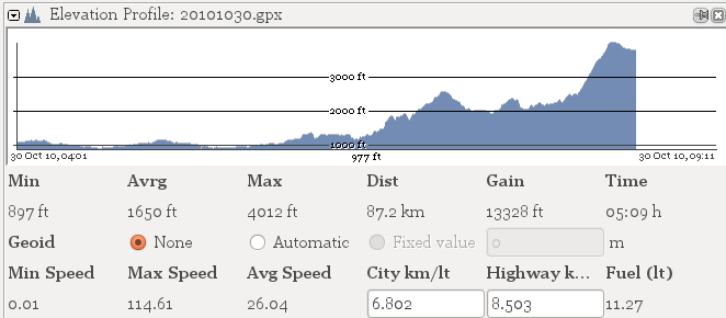
For the gas monitoring application, decided to build it into a JOSM plugin, as it will run on all platforms and should already be part of the MICS GPS toolkit. Started from the ElevationProfile plugin which already generates some stats on GPX files. The modifications add a calculation of fuel usage, based on city and highway fuel consumption rates. The compiled plugin can be downloaded, and then installed in the plugins directory of your JOSM profile; in the Plugins panel of JOSM, simply activate the plugin.
There are lots of ways this can be improved in future applications. ElevationProfile only works on a single GPX file, while this should be adjusted to work on groupings. Additional statistics would be interesting: distance per day, distance average by hour of day, distance average by day of week, distance speed minute by minute; and aligning those stats to points on the map would give some metrics for classification of OSM roads. GPX tracks should have some preprocessing, to simplify and filter out bad readings. Other software to experiment with is Viking an open source, cross platform personal GPS data management tool, and TopCube, which builds desktop apps on node.js apps.
In all this was a lot of fun, opened up some fresh programming avenues for me for dealing with large volume geodata, and should inform further development for MICS.
Opening Data in Kenya. My Method is to Hack.
Posted: August 9th, 2011 | Author: mikel | Filed under: kenya, tech | 2 Comments »A techy cross-post from Brain Off
There’s good reason to join the excitement about Open Data in Kenya. As Tariq says on the World Bank blog
Open data in Kenya is special: it comes at a time of national change; it’s got a head start on tools and expertise from the global open data community and it’s happening in a country where the information ecosystem is still maturing.
I’m proud that our work with Map Kibera has any relation to this at all. And it’s certainly due to the hard work of passionate people, in a tough environment, especially Dr. Bitange Ndemo (if you have the time, Dr. Ndemo’s talk at the World Bank is recommended).
Now that the launch has subsided, and I have a spare moment in the air from Tanzania, I want to look in depth at what data and how data has been released on OpenDataKE, the means of working with the data and collaborating on the data, and how this resource can relate to other open data sets in Kenyan society. Now that the government has made a bold move, I think it’s the responsibility of the software development community and civil society to really step up and test out the data, and suggest how this can become a really vibrant and social resource. Again, Tariq says this succinctly
the call for open data should go hand in hand with a call for better quality data: data that might be collected by official government agencies or in this age, by citizens themselves.
Transect across data
My “method” is to hack. I want to make an interesting simple visualization with some data from OpenDataKE, focusing on Nairobi, using openly available tools. Browsing data sets, the Population Density per Constiuency, derived from the 2009 census, seemed promising. The difference in density across the urban landscape Nairobi is extreme. For a sense of it, just look at the density of features in OpenStreetMap in the map of the slum of Mathare compared to nearby leafy Mathaiga. And to help the hack, the population density data set even has a handy location column.
Or maybe not. The usual practice in tabular data is to split the latitude and longitude into two columns, but here both values are formatted along with the unnecessary name of the province in which the constituency is located. Anyone who has had to work with data is used to little problems like this, and it’s easy enough (for a programmer) to write a quick script to clean this up. So I selected Export to CSV (side note, the other options presented by the platform seem hardly useful), filtered just the constituencies in Nairobi, and cleaned it up just by hand (I was too lazy to script this for just a handful of values).
Gaps and Errors
I uploaded the CSV to GeoCommons, which has facility to deal with many formats of data and easily layer together interactive maps, and was surprised to see that several points weren’t placed in Nairobi at all. Turns out there’s several errors in the location column, at least in Nairobi, and possibly in the rest of the country (I didn’t check). I’d have to correct these by hand. My knowledge of the location and extent of the constituencies is limited, so I needed another source, and that is not something you can find on OpenDataKE. It took some searching until I found scanned maps of contituencies on the Mars Group site. An overview map of all the constituencies was missing, so I used the adjacent constituency names in order to place the mistaken ones.
This worked well, but I’m left with questions. Why isn’t constituency boundary data available on OpenDataKE? How did Mars Group get these maps? And now that I’ve gone to the bother of correcting this data set, how can I contribute the changes back, or at least alert the holders of the data to the errors? There is a nomination section on OpenDataKE, which was wonderfully active until July 9, and then went quiet (did Socrata’s support contract expire then?). Anyway, I’m hopeful these will start getting attention again, so I’ve submitted two requests (pending approval to post), one for constiuency boundaries, and another for a way to correct the location column in the population density data set.
My second surprise was that when I made the annotation size relative to the population density, I didn’t see a big difference among the constituencies. The area where Kibera is located, Langata, is about the same density as Westlands, and both are less than CBD and Eastlands. What’s happening here is that constituencies aren’t aligned to uniform urban settlement patterns. Langata, the home constiuency of the Prime Minister, includes both the slum of Kibera and the wealthy and sparse suburb of Karen. A more useful and telling metric would be population density per Ward, the sub-unit of constituency which does have fairly good alignment to settlement patterns. The census can and has been aggregated to this level, because there was a large promotion of the census count of population in Kibera.
So again I’ve nominated a data set, for the population density aggregated at ward level. And I’ve also made a request for meta-information on the methodology of the census in Kibera and other informal settlements. While the 170,000 figure is surely more close to reality than the wild 1 million figures of the past, by comparing that number with estimates derived from other methods there is a discripency; the others agree on an average closer to 250,000. Additionally, and admittedly anecdotedly, many people in Kibera say they and their neighbors were never counted. Now this happens in any census, and it does not deligitimize the census, but in order to interpret data, openness on the methodology of data collection and analysis is also necessary.
The Civil Society of Data
Open government data exists in a wider ecosystem. Just a few months ago, Columbia University released amazing data sets of Nairobi, including high detail land use under open knowledge licenses. A truly beautiful and informative data set. Another place to find many a Kenyan civil society data set is Virtual Kenya. I thought the population density dataset would be interesting to layer with land use.
This data is distributed as Shapefiles, and I need tiles to use a base map. This is the purpose of MapBox, a rapidly developing tool set to make it easy to build beautiful map tiles. I loaded the Shapefiles in my locally running TileMill, styled the landuse categories based on Columbia’s pdf using carto, assigned interaction, and exported as mbtiles. These were dropbox’d, and posted to TileStream, as this map.
Mouseover or click on the map to get more detail about each parcel. This interaction technique is really interesting (as a geek), it’s entirely javascript and lightweight in the browser; it still has a few rough edges, but overall, a nice experience. There are limits, like TileMill doesn’t work with CSV, or permit multiple interactive layers, but it’s a great work in progress. Thanks to DevSeed for the TileStream account, and Dane Springmeyer, who spent some time with me hacking and bug hunting the interaction features of mapnik.
Like the OpenDataKE data set, and actually all data sets, there are errors … there is no such thing as a perfect map. The Ethiopian Church, across from YaYa, is not indicated nor is its land zoned as “public use” as other church lands in Nairobi are. And the Sarakasi Dome, home of our yoga practice in Nairobi, is not shown a unified plot at all. Now Columbia makes their contact information known on the site, and I’ve met them personally, so feedback here is direct over email, but I wonder from here … what is the method and intention to continually correct, update and discuss these data sets? Does it need to?

Of course, that is the primary approach of OpenStreetMap … geographic data in a wiki, that gets constantly examined, updated, and discussed, completely openly. OpenStreetMap can provide another overlay, so we can have some roads and points of reference for the final map. So on GeoCommons, I configured the tiles from the land use data on TileMill (this required some hidden configuration of the tile scheme), composited over semi-transparent OSM data (provided by GeoCommons through Acetate), and then finally, the population density points. This is the result for now of the data transect.
I hope I can improve this. You’ll see that the OSM streets don’t overlay precisely with land use. This I believe, but haven’t confirmed, to be the result of a project error in the Land Use data set. And an even better representation of the population density would have been a geo-join with area boundaries, had they been available. This would clearly show a thematic variation of population density. And of course, finer grained detail will be required to fulfill the original intention to show Nairobi’s vast differences in population density.
Where have we gone
Government data sets, authoratative civil society data sets, and completely crowd sourced data sets, layerd together in a single map, revealing a little more about Nairobi, and about the data itself. Each is collected, distributed, and updated in different methods. In some ways, I feel OSM leads the wild edge here of what’s possible, and what we want: a truly social environment for data. Data without community is data dry and unimportant. Of course, I’m not saying OSM is the final repository for all data: OSM doesn’t deal with demographic and private data of a census, and the methods to authoritatively certify versions of OSM data are just starting. But this hasn’t stopped several kinds of OSM and government interaction already beyond the “traditional” import, with the likes of Portland and the USGS interacting with the OSM community.
The ultimate promise of all this OpenDataKE is not necessarily in the data itself, but in the deep and wide serving conversations openness triggers. My own personal metric for this will be when government officials from OpenDataKE and slum dwellers from Kibera and Mathare (and Mukuru) openly collaborate and work together. Can’t wait to see this happen. To get there, I challenge you too … get geeky with some data and write about it!
Rambling Feet and Thoughts in the Hills Above Port au Prince
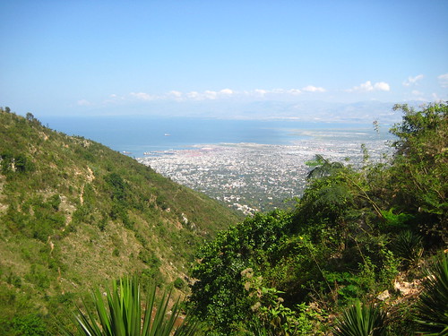
Posted: March 13th, 2011 | Author: mikel | Filed under: haiti, tech | 1 Comment »On Tuesday, Leonard took us hiking up the hills above Port au Prince. Beautiful and refreshing after the first intense days of acclimatization here.
Leonard pointed out this structure. Though this canyon is relatively forested compared with the rest of Haiti, it’s still heavily deforested, and erosion is pretty serious in spots. Researching later, this structure turns out to be Rock Weir, designed to stabilize the canyon under a steeply falling channel of water; and also, a pretty decent footpath across.
Someone, or some organization put in a lot of work. Who are they? When did they do this? How much did it cost? Will they check back on it? What else have they done nearby? All questions we had right there, but we had no answer right there, or anywhere. Aid projects are sprinkled across the country. Yesterday at BarCamp, heads nodded to the observation “The UN is the government of Haiti”. No one has a comprehensive idea about all the work that has been done in Haiti since the quake … How much money has come in? Who has done what? What has succeeded?
Leonard has named the Haiti initiative for grassroots aid accountability Tanbou. In one part it requires a means for Haitians to express their views. In the other part, it requires good open data from international and local actors. My suggestion is that IOM eat it’s own dog food, and start publishing it’s projects openly here … even if they are dry and technical, it can be a start.
I made a contribution to the effort by adding the Rock Weir to OpenStreetMap.
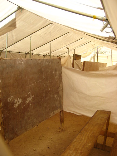
We went back down through a small village perched on the hills, met the head man, and took a look at their schools. The one above was in an emergency tent, blazoned with the Unicef logo but obviously not distributed for this purpose, with small partitions inside for classrooms. Eighty young students crowded inside here on a school day (school was out today, it was the middle of Carneval) and must have made a racket! Another school was under construction, made of cement, and reportedly financed by the local Rotary Club.
I noted all the details, and recorded both schools in OpenStreetMap, using some tags we had developed for collecting school data in Kibera, and noting the state of construction.
There was drive and ambition in this village, and they need help. We talked briefly about Facebook presence, and thoughts drifted to how Citizen Haiti might really and truly allow this small place to voice its triumph and needs.
The hike was refreshing. The kind of work we need to do was more clear, and I felt I knew Haiti just a tiny bit better. And I was able to geek out, and maybe demonstrate a few ideas linking data collection, media and reporting, and aid feedback.
We collected a a few photos, improved OpenStreetMap, and using a small bit of code, linked together maps and media and told this small story.


